Clever Algorithms: Nature-Inspired Programming Recipes
A book by Jason BrownleeHome | Read Online | Amazon | GoodReads | Google Books | PDF (code) | GitHub
Visualizing Algorithms
This section considers the role of visualization in the development and application of algorithms from the fields of Metaheuristics, Computational Intelligence, and Biologically Inspired Computation. Visualization can be a powerful technique for exploring the spatial relationships between data (such as an algorithm's performance over time) and investigatory tool (such as plotting an objective problem domain or search space). Visualization can also provide a weak form of algorithm testing, providing observations of efficiency or efficacy that may be indicative of the expected algorithm behavior.
This section provides a discussion of the techniques and methods that may be used to explore and evaluate the problems and algorithms described throughout this book. The discussion and examples in this section are primarily focused on function optimization problems, although the principles of visualization as exploration (and a weak form of algorithm testing) are generally applicable to function approximation problem instances.
Gnuplot
Gnuplot is a free open source command line tool used to generate plots from data. It supports a large number of different plot types and provides seemingly limitless configurability. Plots are shown to the screen by default, but the tool can easily be configured to generate image files as well as LaTex, PostScript and PDF documents.
Gnuplot can be downloaded from the website (Gnuplot URL: http://www.gnuplot.info) that also provides many demonstrations of different plot types with sample scripts showing how the plots were created. There are many tutorials and examples on the web, and help is provided inside the Gnuplot software by typing help followed by the command name (for example: help plot). For a more comprehensive reference on Gnuplot, see Janert's introductory book to the software, "Gnuplot in Action" [Janert2009].
Gnuplot was chosen for the demonstrations in this section as useful plots can be created with a minimum number of commands. Additionally, it is easily integrated into a range of scripting languages is supported on a range of modern operating systems. All examples in this section include both the resulting plot and the script used to generate it. The scripts may be typed directly into the Gnuplot interpreter or into a file which is processed by the Gnuplot command line tool. The examples in this section provide a useful starting point for visualizing the problems and algorithms described throughout this book.
Plotting Problems
The visualization of the problem under study is an excellent start in learning about a given domain. A simple spatial representation of the search space or objective function can help to motivate the selection and configuration of an appropriate technique.
The visualization method is specific to the problem type and instance being considered. This section provides examples of visualizing problems from the fields of continuous and combinatorial function optimization, two classes of problems that appear frequently in the described algorithms.
Continuous Function Optimization
A continuous function optimization problem is typically visualized in two dimensions as a line where $x=input, y=f(input)$ or three dimensions as a surface where $x,y=input, z=f(input)$.
Some functions may have many more dimensions, which if the function is linearly separable can be visualized in lower dimensions. Functions that are not linearly-separable may be able to make use of projection techniques such as Principle Component Analysis (PCA). For example, preparing a stratified sample of the search space as vectors with associated cost function value and using PCA to project the vectors onto a two-dimensional plane for visualization.
Similarly, the range of each variable input to the function may be large. This may mean that some of the complexity or detail may be lost when the function is visualized as a line or surface. An indication of this detail may be achieved by creating spot-sample plots of narrow sub-sections of the function.
Figure (below) provides an example of the Basin function in one dimension. The Basin function is a continuous function optimization that seeks $\min f(x)$ where $f=\sum_{i=1}^n x_{i}^2$, $-5.0\leq x_i \leq 5.0$. The optimal solution for this function is $(v_0,\ldots,v_{n-1})=0.0$. Listing (below) provides the Gnuplot script used to prepare the plot ($n=1$).
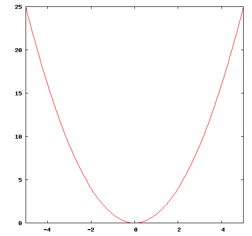
set xrange [-5:5]
plot x*x
Figure (below) provides an example of the basin function in two-dimensions as a three-dimensional surface plot. Listing (below) provides the Gnuplot script used to prepare the surface plot.
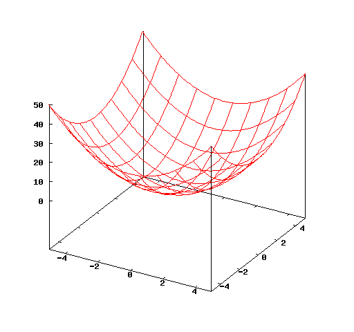
set xrange [-5:5]
set yrange [-5:5]
set zrange [0:50]
splot x*x+y*y
Both plots show the optimum in the center of the domain at $x=0.0$ in one-dimension and $x,y=0.0$ in two-dimensions.
Traveling Salesman Problem
The Traveling Salesman Problem (TSP) description is comprised of a list of cities, each with a different coordinate (at least in the case of the symmetric TSP). This can easily be visualized as a map if the coordinates at latitudes and longitudes, or as a scatter plot.
A second possible visualization is to prepare a distance matrix (distance between each point and all other points) and visualize the matrix directly, with each cell shaded relative to the distances of all other cells (largest distances darker and the shorter distances lighter). The light areas in the matrix highlight short or possible nearest-neighbor cities.
Figure (below) provides a scatter plot of the Berlin52 TSP used through out the algorithm descriptions in this book. The Berlin52 problem seeks a permutation of the order to visit cities (called a tour) that minimize the total distance traveled. The optimal tour distance for Berlin52 is 7542 units.
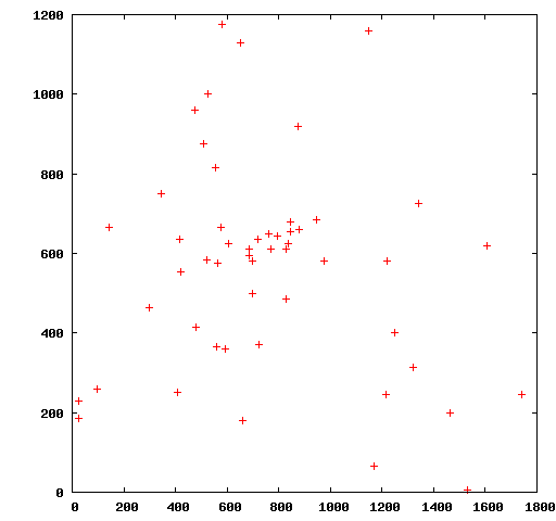
Listing (below) provides the Gnuplot script used to prepare the plot, where berlin52.tsp is a file that contains a listing of the coordinates of all cities, one city per line separated by white space. Listing (below) provides a snippet of the first five lines of the berlin52.tsp file.
plot "berlin52.tsp"
565.0 575.0
25.0 185.0
345.0 750.0
945.0 685.0
845.0 655.0
...
berlin52.tsp file.The scatter plot shows some clustering of points toward the middle of the domain as well as many points spaced out near the periphery of the plot. An optimal solution is not obvious from looking at the plot, although one can see the potential for nearest-neighbor heuristics and importance of structure preserving operations on candidate solutions.
Plotting Algorithm Performance
Visualizing the performance of an algorithm can give indications that it is converging (implemented correctly) and provide insight into its dynamic behavior. Many algorithms are very simple to implement but exhibit complex dynamic behavior that is difficult to model and predict beforehand. An understanding of such behavior and the effects of changing an algorithm's parameters can be understood through systematic and methodological investigation. Exploring parameter configurations and plots of an algorithm's performance can give a quick first-pass approximation of the algorithms capability and potentially highlight fruitful areas for focused investigation.
Two quite different perspectives on visualizing algorithm performance are: a single algorithm run and a comparison between multiple algorithm runs. The visualization of algorithm runs is explored in this section in the context of the Genetic Algorithm applied to a binary optimization problem called OneMax (see ).
Single Algorithm Run
The performance of an algorithm over the course of a single run can easily be visualized as a line graph, regardless of the specific measures used. The graph can be prepared after algorithm execution has completed, although, many algorithm frameworks provide dynamic line graphs.
Figure (below) provides an example line graph, showing the quality of the best candidate solution located by the Genetic Algorithm each generation for a single run applied to a 64-bit OneMax problem. Listing (below) provides the Gnuplot script used to prepare the plot, where ga1.txt is a text file that provides the fitness of the best solution each algorithm iteration on a new line. Listing (below) provides a snippet of the first five lines of the ga1.txt file.
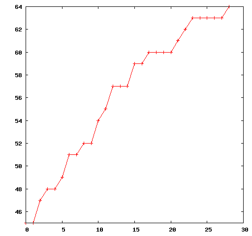
set yrange [45:64]
plot "ga1.txt" with linespoints
45
45
47
48
48
...
ga1.txt file.Multiple Algorithm Runs
Multiple algorithm runs can provide insight into the tendency of an algorithm or algorithm configuration on a problem, given the stochastic processes that underlie many of these techniques. For example, a collection of the best result observed over a number of runs may be taken as a distribution indicating the capability of an algorithm for solving a given instance of a problem. This distribution may be visualized directly.
Figure (below) provides a histogram plot showing the best solutions found and the number of times they were located by Genetic Algorithm over 100 runs on a 300-bit OneMax function.
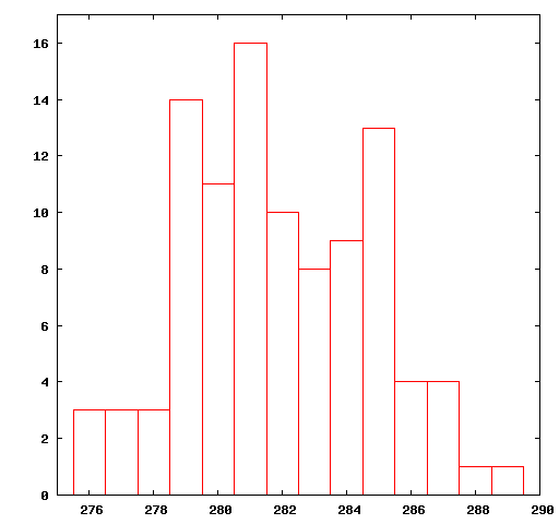
Listing (below) provide the Gnuplot script used to prepare the plot, where ga2.histogram.txt is a text file that contains discrete fitness values and the number of times it was discovered by the algorithm over 100 runs.
set yrange [0:17]
set xrange [275:290]
plot "ga2.histogram.txt" with boxes
Listing (below) provides a snippet of the first five lines of the ga2.histogram.txt file.
276 3
277 3
278 3
279 14
280 11
...
ga2.histogram.txt file.Multiple Distributions of Algorithm Runs
Algorithms can be compared against each other based on the distributions of algorithm performance over a number of runs. This comparison usually takes the form of statistical tests that can make meaningful statements about the differences between distributions. A visualization of the relative difference between the distributions can aid in an interpretation of such statistical measures.
A compact way for representing a distribution is to use a box-and-whisker plot that partitions the data into quartiles, showing the central tendency of the distribution, the middle mass of the data (the second and third quartiles), the limits of the distribution and any outliers. Algorithm run distributions may be summarized as a box-and-whisker plots and plotted together to spatially show relative performance relationships.
Figure (below) provides box-and-whisker plots of the best score distribution of 100 runs for the Genetic Algorithm applied to a 300-bit OneMax problem with three different mutation configurations. The measure collected from each run was the quality of the best candidate solution found.
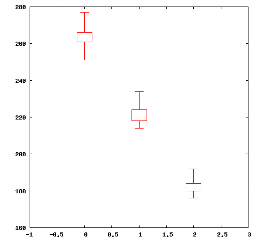
Listing (below) provide the Gnuplot script used to prepare the plot, where the file boxplots1.txt contains summaries of the results one run per line, each each line containing the min, first, second, and third quartiles and the max values separated by a space. Listing (below) provides a complete listing of the three lines of the boxplots1.txt file.
set bars 15.0
set xrange [-1:3]
plot 'boxplots1.txt' using 0:2:1:5:4 with candlesticks whiskerbars 0.5
251.0 261.0 263.0 266.0 277.0
214.0 218.0 220.0 224.0 234.0
176.0 180.0 182.0 184.0 192.0
boxplots1.txt file.Plotting Candidate Solutions
Visualizing candidate solutions can provide an insight into the complexity of the problem and the behavior of an algorithm. This section provides examples of visualizing candidate solutions in the context of their problem domains from both continuous and combinatorial function optimization.
Continuous Function Optimization
Visualizing candidate solutions from a continuous function optimization domain at periodic times over the course of a run can provide an indication of the algorithms behavior in moving through a search space. In low dimensions (such as one or two dimensions) this can provide qualitative insights into the relationship between algorithm configurations and behavior.
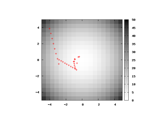
Figure (below) provides a plot of the best solution found each iteration by the Particle Swarm Optimization algorithm on the Basin function in two dimensions (see ). The positions of the candidate solutions are projected on top of a heat map of the Basin function in two-dimensions, with the gradient representing the cost of solutions at each point.
Listing (below) provides the Gnuplot script used to prepare the plot, where pso1.txt is a file that contains the coordinates of the best solution found by the algorithm, with one coordinate per line separated by a space.
Listing (below) provides a snippet of the first five lines of the pso1.txt file.
set xrange [-5:5]
set yrange [-5:5]
set pm3d map
set palette gray negative
set samples 20
set isosamples 20
splot x*x+y*y, "pso1.txt" using 1:2:(0) with points
-3.9986483808224222 3.8910758979126956 31.12966051677087
-3.838580364459159 3.266132168962991 25.402318559546302
-3.678512348095896 2.6411884400132863 20.507329470753803
-3.518444331732633 2.0162447110635817 16.44469325039336
-3.35837631536937 1.391300982113877 13.214409898464986
...
pso1.txt file.Traveling Salesman Problem
Visualizing the results of a combinatorial optimization can provide insight into the areas of the problem that a selected technique is handling well, or poorly. Candidate solutions can be visualized over the course of a run to observe how the complexity of solutions found by a technique change over time. Alternatively, the best candidate solutions can be visualized at the end of a run.
Candidate solutions for the TSP are easily visualized as tours (order of city visits) in the context of the city coordinates of the problem definition.
Figure (below) provides a plot of an example Nearest-Neighbor solution for the Berlin52 TSP. A Nearest-Neighbor solution is constructed by randomly selecting the first city in the tour then selecting the next city in the tour with the minimum distance to the current city until a complete tour is created.
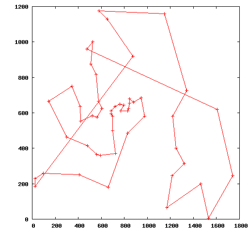
Listing (below) provides the Gnuplot script used to prepare the plot, where berlin52.nn.tour is a file that contains a listing of the coordinates of all cities separated by white space in order that the cities are visited with one city per line. The first city in the tour is repeated as the last city in the tour to provide a closed polygon in the plot.
Listing (below) provides a snippet of the first five lines of the berlin52.nn.tour file.
plot "berlin52.nn.tour" with linespoints
475 960
525 1000
510 875
555 815
575 665
...
Figure (below) provides a plot of the known optimal solution for the Berlin52 Traveling Salesman problem.
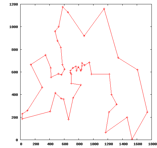
Listing (below) provides the Gnuplot script used to prepare the plot, where berlin52.optimal is a file that contains a listing of the coordinates of all cities in order that the cities are visited with one city per line separated by white space. The first city in the tour is repeated as the last city in the tour to provide a closed polygon in the plot.
plot "berlin52.optimal" with linespoints
Listing (below) provides a snippet of the first five lines of the berlin52.optimal file.
565.0 575.0
605.0 625.0
575.0 665.0
555.0 815.0
510.0 875.0
...
berlin52.optimal file.Bibliography
| [Janert2009] | P. Janert, "Gnuplot in Action: Understanding Data with Graphs", Manning Publications, 2009. |
Please Note: This content was automatically generated from the book content and may contain minor differences.